The Universal. A Place to Start.
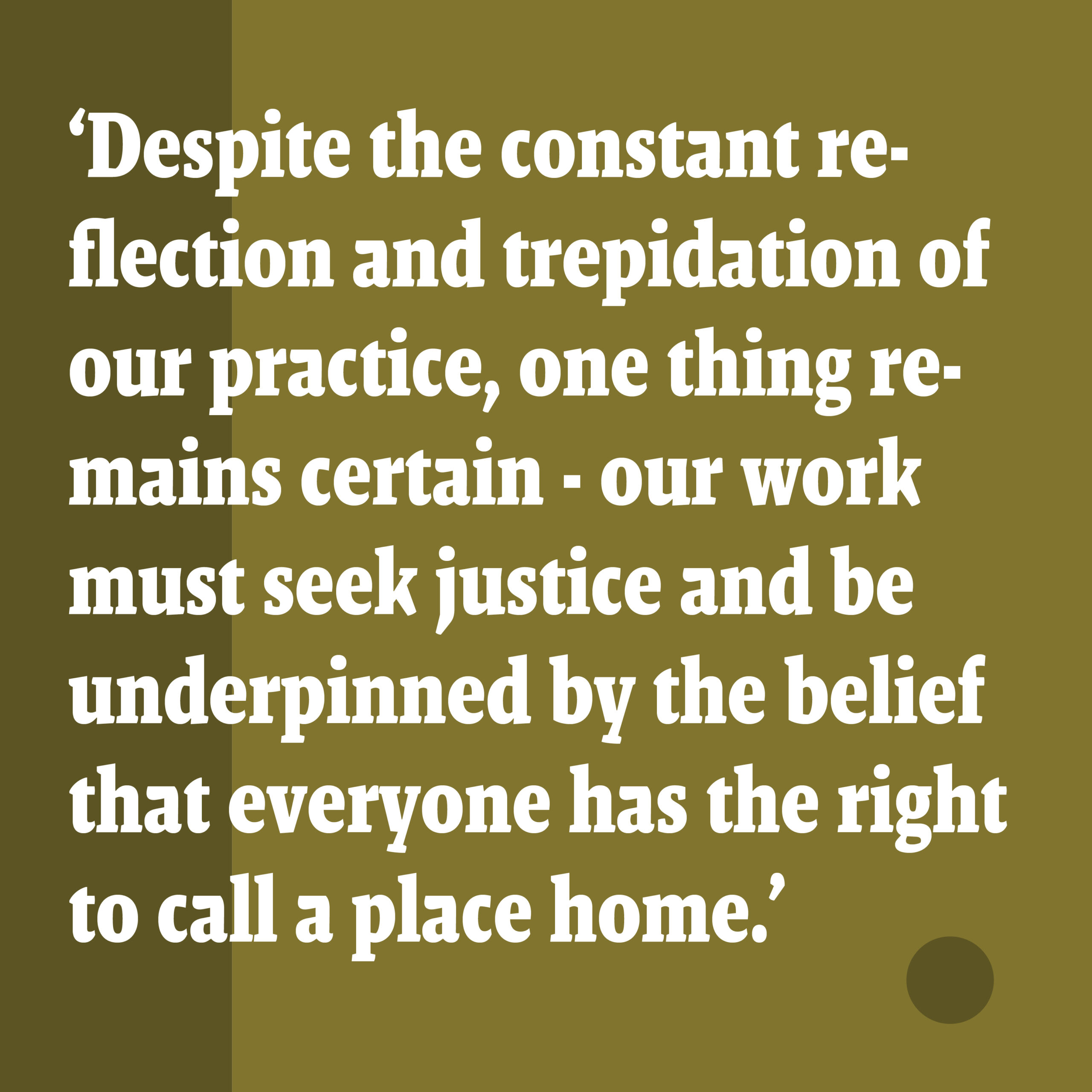
The intent of the TheFulcrum.Agency is an expansive one. It’s there in the name (ie ‘fulcrum’). It is a dedication to leverage evidence-based design-thinking to improve lives. It is the antithesis of style-based or output-focused architecture. It is concerned with the effect rather than purely the form.
This universal idea – the simplest of machines and the fulfilment of human needs, rather than the superficiality and immediacy of style – was a natural starting point for the consideration of the identity for this new enterprise.
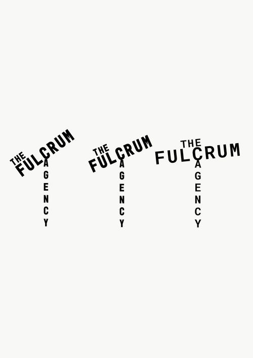
If this is to be successful, the Agency must be a business built on content and substance, rather than style or fashion. And its visual identity must communicate this.
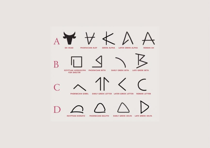
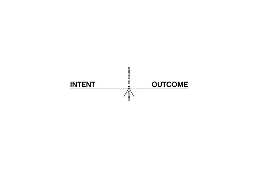
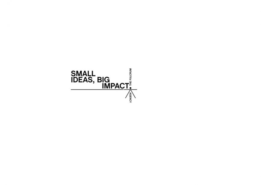
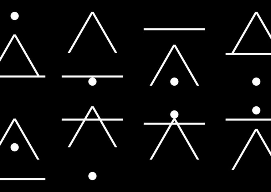
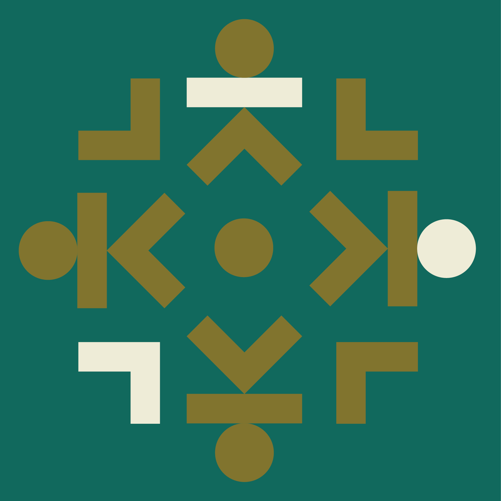
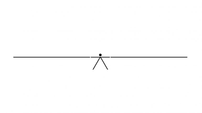
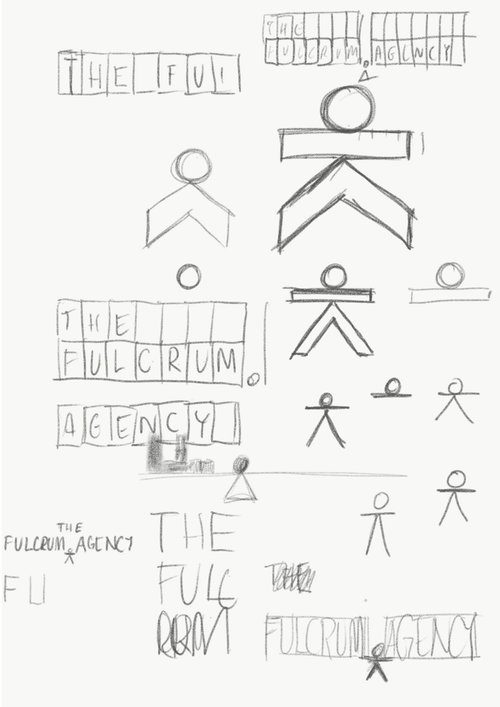
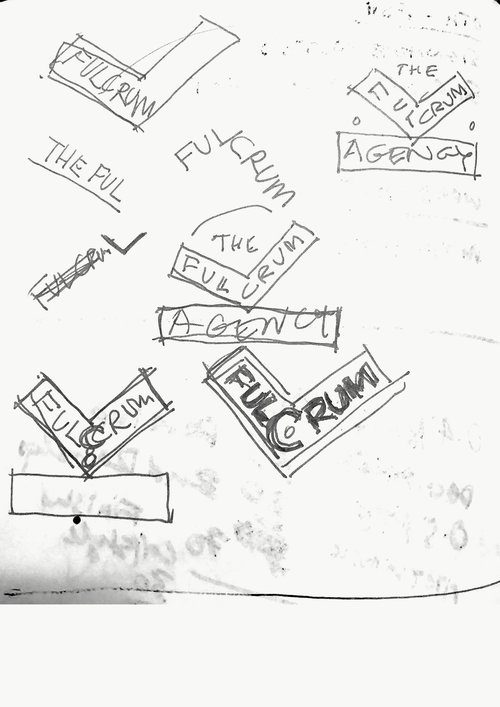
Our first exploration of this idea of universality led us to the most fundamental of graphic images, the representation of the human form and its abstraction into visual language. Through a reductivist method, we created a symbol that is at once the human form but also a diagrammatic representation of a lever system. A circle forming the head (and the dot in TheAgency.com), a line being the beam (and arms), and the fulcrum being represented by an acute angled line (the legs).
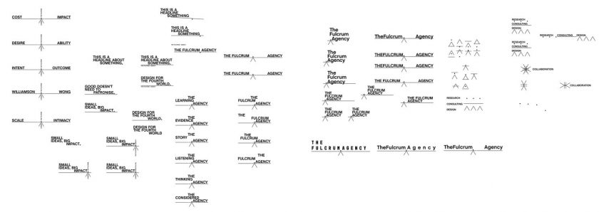
The individual elements of this mark could then be used to construct their own visual language: glyphs that are empty vessels waiting to be filled with meaning that is assigned to them (much like the foundation of written language).
The structure can interact with content in the form of headlines or descriptors, creating a look that is driven by the concept and content rather than style. And that all is constructed around, and out from, the dot – the pivot point.
Is it possible to create a brand that is based on unadorned content alone, that rejects the usual emphasis on style over substance? Perhaps.
Unintentionally, though, this route led us to realm that others in our sector had already staked out well. We weren’t comfortable that we could find a minimalist solution incorporating the ‘universal man’ icon that wouldn’t appear to be mimicking these.
Another, unrelated concern, was that we were venturing into a territory that seems to the style du jour for architectural businesses wishing to present an intellectual and theoretical face to the world.
There are whole design blogs dedicated to documenting these minimalist, international style identities. These identities lack differentiation and, in their hunt for a universality, end up somewhere with a complete lack of humanity.
Next Article

Project Archive
(View Article)